Building and protecting the visual foundation of one of America's most significant historic institutions.
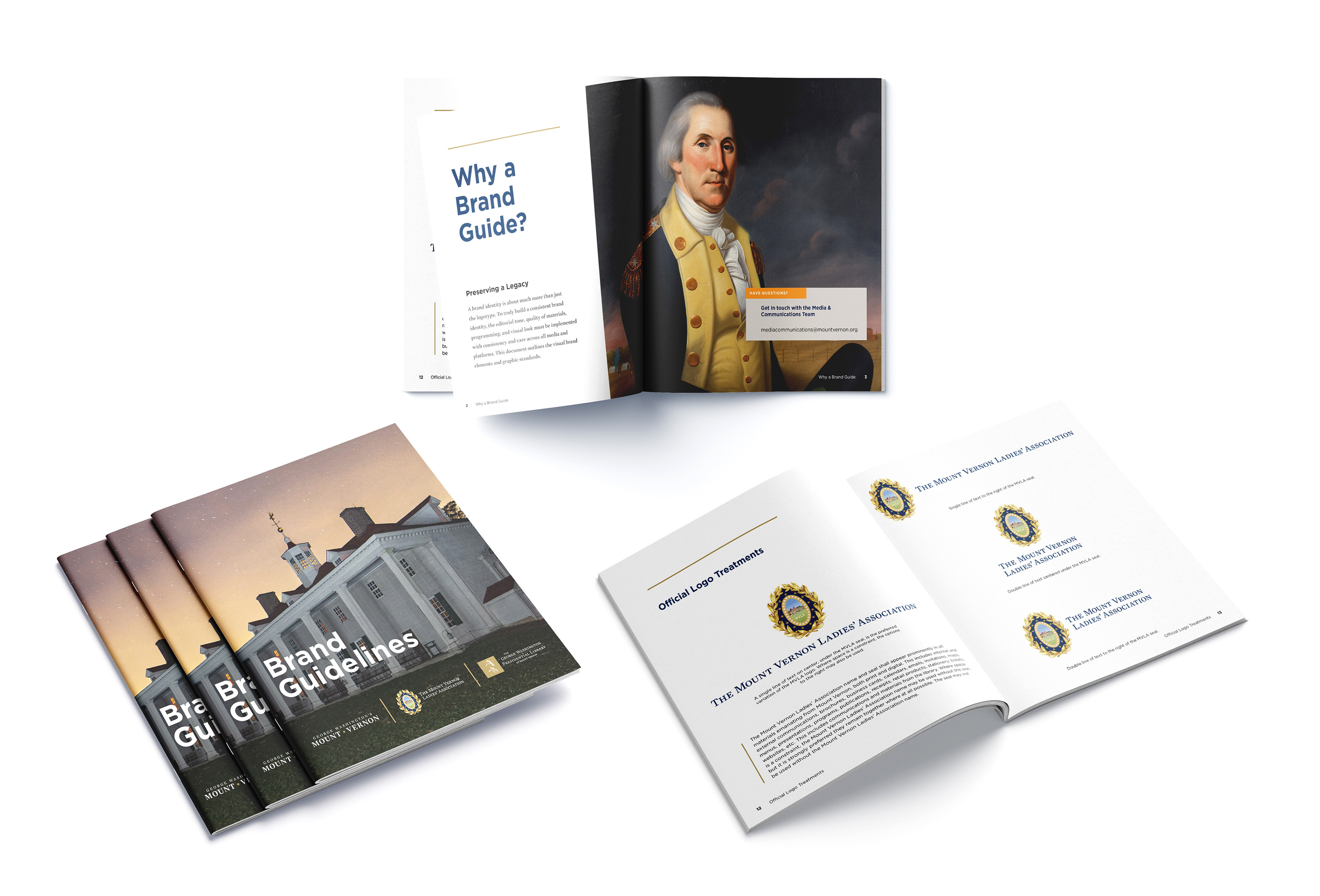
When I joined George Washington's Mount Vernon as the institution's Creative Director, my immediate responsibility was establishing a unified visual identity across three distinct but deeply connected brands. Mount Vernon, the Mount Vernon Ladies' Association, and the George Washington Presidential Library each carried their own legacy and their own audience. My work was to honor all three while building a system that allowed them to coexist with clarity, consistency, and strength.
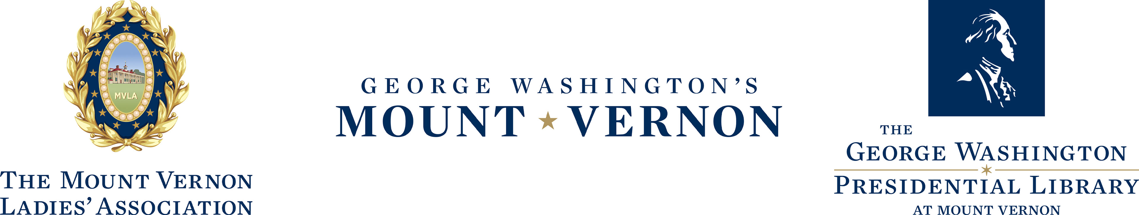
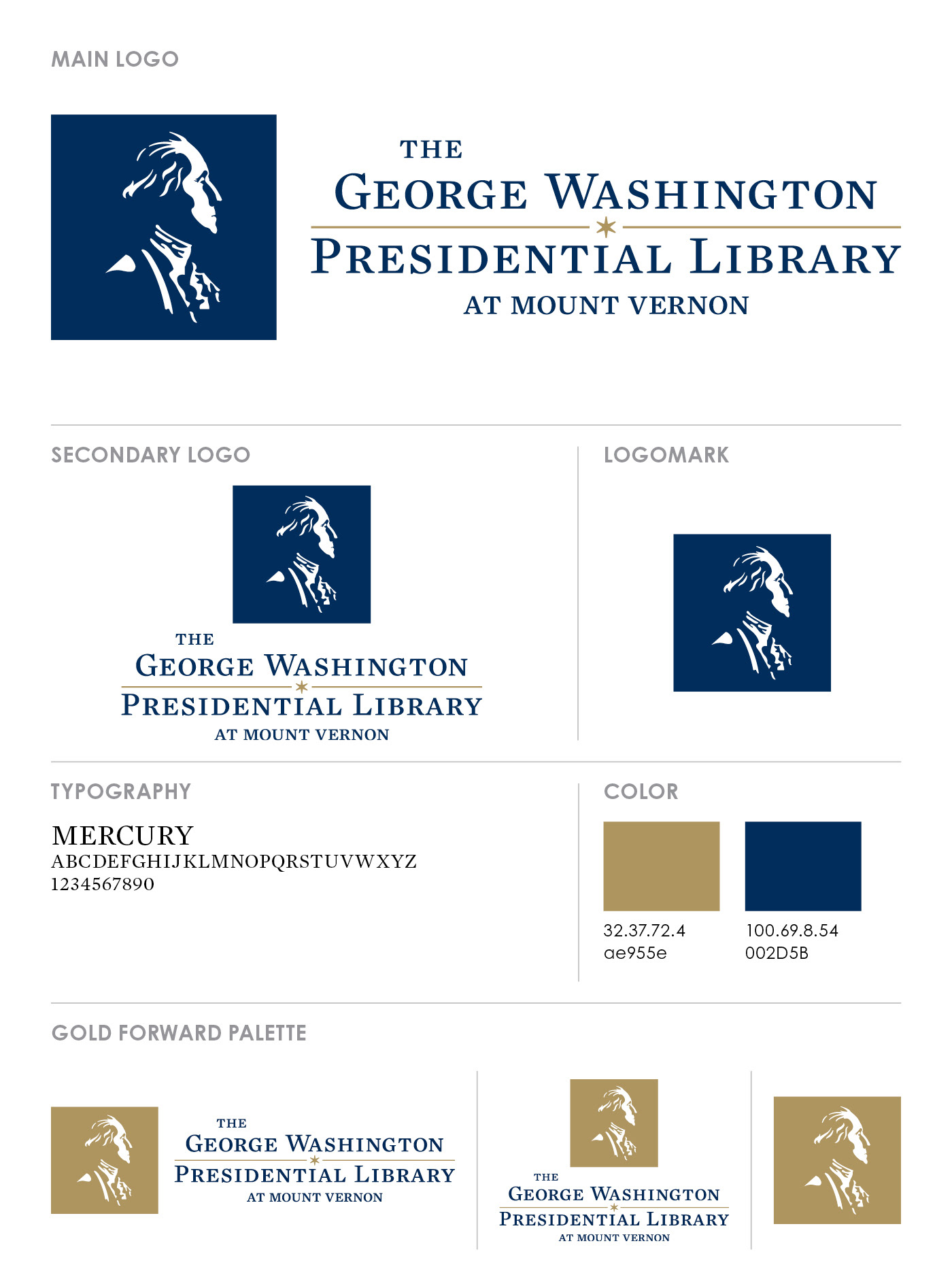
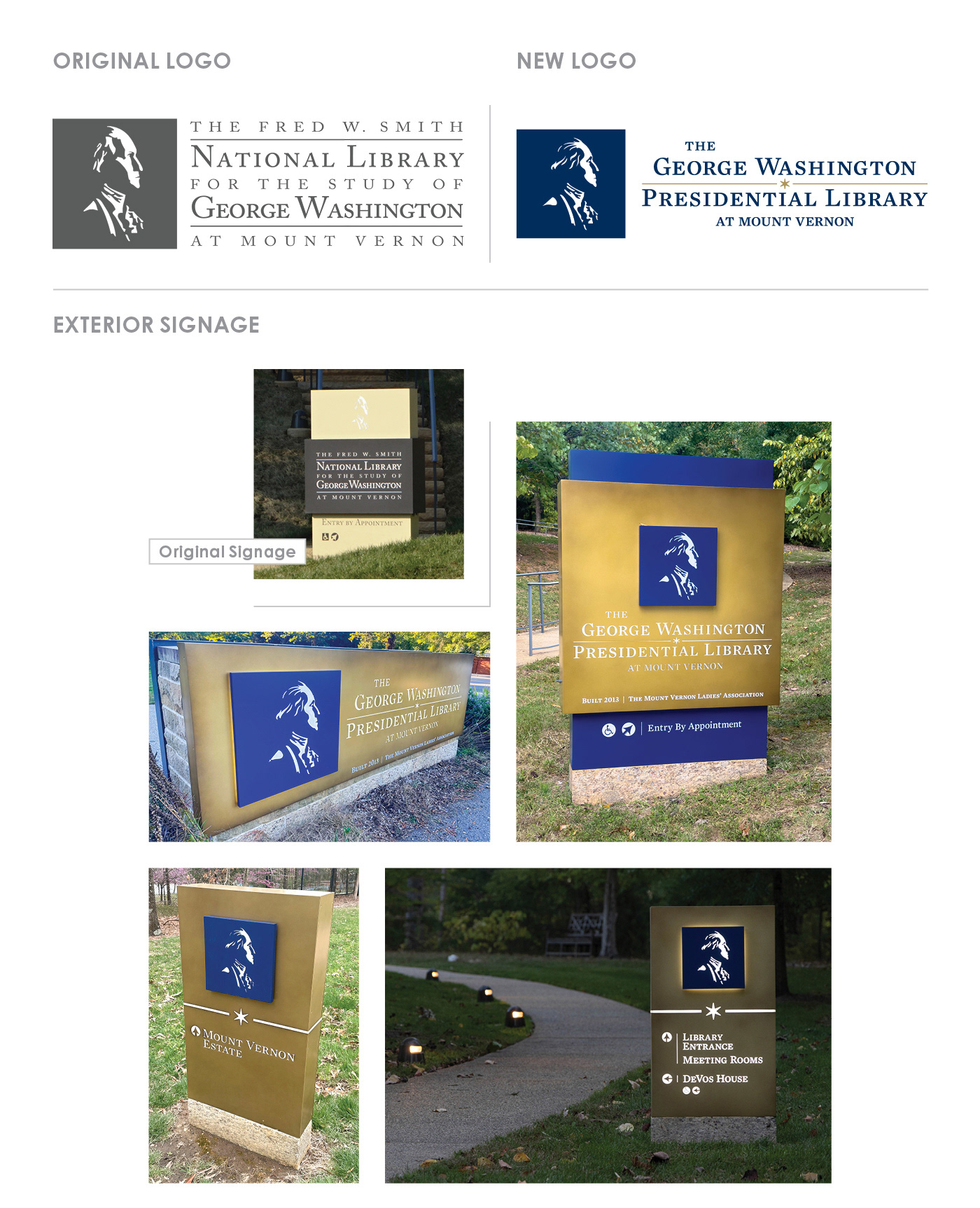
Rebranding the George Washington Presidential Library was the greatest thrill of my career. There are only a limited number of Presidential Libraries in the country, and designing one for our first president is an extraordinary responsibility. The Library was ten years old and its existing logo, while familiar, had grown outdated and no longer did justice to the man it represented. Rather than starting from scratch I chose to evolve it, honoring what existed while dramatically improving it. The updated mark draws inspiration from the Houdon bust, a life cast taken from Washington himself, resulting in a portrait that finally looks like George Washington. The new identity aligns seamlessly with both the Mount Vernon brand and the Mount Vernon Ladies' Association, allowing all three to coexist with clarity and strength. It is a mark rooted in authenticity, accuracy, and legacy.
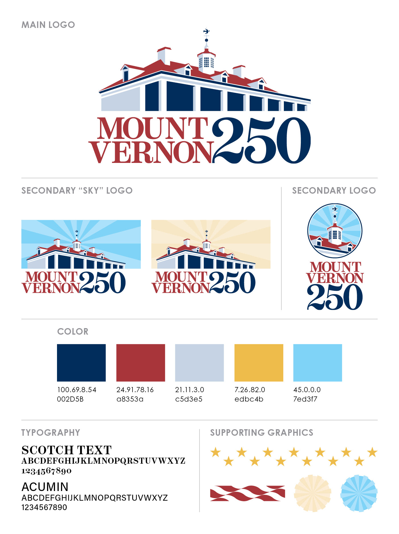
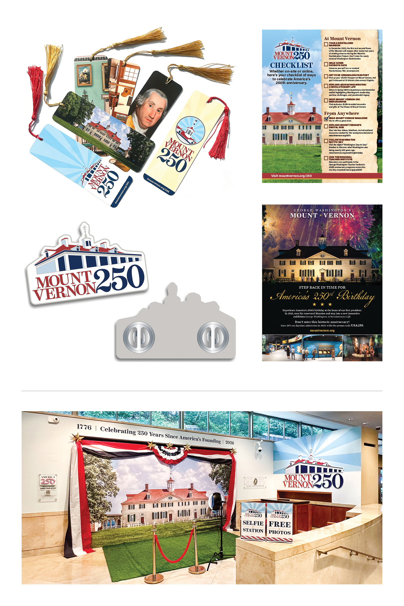
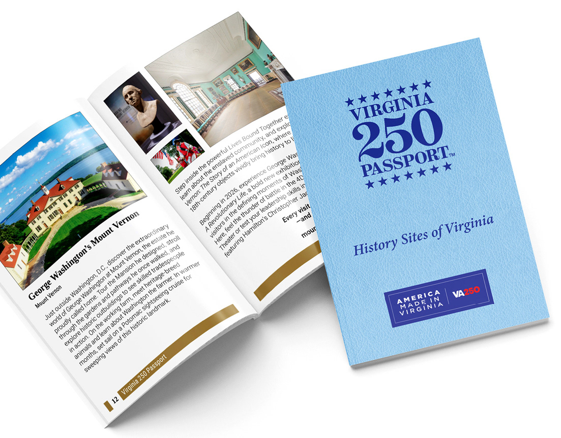
The Mount Vernon 250 logo rounds out this body of work. Designed to celebrate America's 250th anniversary at one of its most storied historic sites, the mark has taken on a life of its own. It anchors a prominent selfie booth display in the orientation center, enjoyed by thousands of visitors every day, and lives across t-shirts, hats, glassware, and merchandise throughout the Mount Vernon shops. For a designer who cares deeply about history and place, it was a privilege to create something that belongs to this moment.